The struggle of transiting to digital for everything is so real these days, especially when it’s become more of a necessity than an option. For businesses, this is an opportunity to make yourself known to prospective clients and stand out among competitors.
There are guidelines you can practice to ensure that clients choose your service over a competitor. One of those guidelines is having a strong and captivating landing page.
Pave the path for prospective clients
Landing pages are great for guiding your target audience where you want them to go, whether that’s toward a special offer or a free consultation. Their purpose is to guide prospective clients towards an action.
As the first step in getting your prospective clients closer to what they’re looking for, landing pages provide a variety of solutions, from providing clients with the information they need on why or how they should make the move with your service, or a landing page can even serve as an extension of your brand and mission.
In a nutshell, landing pages are the simplest way to collect leads for your business, as their role is mainly to convert—which means that the goal is to get a prospective client that’s visiting the page to click exactly where you want them to click.
These clicks can be obtained by using copy and design that captures attention as well as builds trust, and action-oriented call-to-actions that point your audience in the right direction. As a lead generation tool, the landing page works to draw in your target audience and convert them.
Now let’s get into what exactly to put on your landing page to inspire action.
The 5 elements of a high converting landing page
Above the fold hero text that demands attention
Hero Images and text—also known as above the fold content—combine to give your site’s visitors their very first impression of your business. As the leading message that people first see when they come to your page, successful landing pages often feature an impactful belief statement or an attention grabber that piques interest.
Viewers tend to relate more to sayings and phrasing that evokes emotion and that gratify their needs. Try to dig a little deeper to find out how to draw them in through text to be a driving force in high conversion.
This hero section is the first step towards your audience connecting the dots between what they are looking for, and knowing they’ve found it. Using this section above the fold to create awareness about what you’re offering, its purpose, and even showing how it can be used are a great use of this prime real estate.
Videos that help convert
Experts at the Harvard Business Review say that you have less than eight seconds to capture someone’s attention by showing them how you cater to their needs. You can give them a lot of information in a small amount of time, and also give them the freedom to obtain simplified information that they can easily share with a click of a button.
Humans are visual creatures by nature so applying something captivating will leave a good first impression. And what better way to do than with 2020’s biggest content trend?
Video is a major turning point for increasing conversion and for building trust, as prospective clients can see that there’s actually a person behind this offer.
And…in the United States alone online video content is viewed by 85% of internet users per month. So the opportunity to convert is there. You just have to seize it.
Videos create a great opportunity to show your audience how your services work, without a huge block of text. This can be done through a quick 30-second walk-through or even with a client testimonial where viewers can actually see how you’ve impacted your clients’ lives for the better.
Whether you want your page visitors to sign up for your email newsletter or to leave their contact information for a consultation, the primary goal of your landing page is to guide your viewer toward your goal. Video that is short yet engaging steers them closer to that goal.
Want to learn more about how you can use short-form video? Check out 3 different ways here.
Images that make sense
Since attention spans are quickly fleeting, it is important to use images as intentionally as possible.
Pictures, like videos, need to make a lasting impression in a short amount of time. Images are a quick way to make your audience feel something and can transform your landing page from words on a screen to an experience. Now that golden nugget is an essential tool on how to create a landing page that converts.
Not only can pictures say a lot, but they can make you feel a lot too. Emotion-evoking images cause action and that is an ingredient for success.
Take You & Yours Distillery in downtown San Diego as an example. They describe themselves as a relaxing yet elevating place that exudes the perfect ambiance people for almost any occasion. Of course, they highlight how “Instagram worthy” they are, which is a selling point for their specific target audience to grow their social media exposure. But without a visual, these statements are just statements.

You & Yours, like many other businesses, use creative imagery and ambiance to increase conversion. Using imagery to create an environment allows their target audience to feel “all the feels” without actually being present (which is a great tool for event spaces!). Other ways that businesses can use pictures to convert are by showing your services in action, collecting client photos, or by even just incorporating visuals like arrows onto the page.
Service descriptions that are client-friendly
Regardless of your industry, your prospective clients love to feel valued and seen. What better way to show them that you understand than to talk about your services in a way that they can understand? Case studies such as testimonials or reviews if used right can be stress relievers that heighten your target audience’s experience and trust, leading them one step closer to engagement with you.
People know what they want, so reading through endless and irrelevant information makes them frustrated and eventually they leave your site for your competitors.
One way to do that is through bullet points and lists, which highlight important information in an easily digestible manner.
Call to Actions (CTAs) that actually incite action
The objective lies in combining all the above and the call to action to obtain a high conversion landing page. Your CTA button is a link to the next part of your marketing strategy. It will lead to them enrolling in a service, signing up for a live chat, or leaving their email addresses so you can get back with them.
Clicking the call to action button allows the audience to take advantage of the situation using the keywords, talking points, and images that have been presented to them. It is literally the map that shows the audience what happens next.
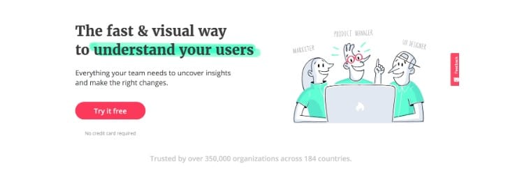
Below is an example of a great CTA from a tool that the Wayward Kind team highly recommends:

This call to action is easy on the eyes, as everyone loves free stuff. Not only does Hotjar emphasize the free aspect of their offer but they underline exactly what they are appealing to, so you can use it to understand your audience. It’s efficient, simple, and to the point.
Solving problems before they happen
A big part of creating a landing page that converts and solves problems is to start by addressing those problems. These problems, often called “pain points” are just as diverse as your audience. Addressing the pain point and creating viable solutions will allow you to be always ahead of the competition.
Purposeful content drives results
Using these five elements is essential when it comes to creating a landing page that converts. It’s not an easy task but one that when done right, can move mountains for both you and your business.
Your prospective clients are looking for a service that solves all their pain points, which means that they’re willing to put in the time to research and compare services from your business with your competitors’. Help make their decision easy by giving them the information they need to feel empowered to make a decision that they trust.
Landing pages are the first steps to the end of the rainbow and Wayward Kind is here to support you in making that journey smooth. Let’s create meaningful content that leads to conversion.
Still have questions about landing pages, or creating content that improves lead generation? Let’s chat.

We can help you master your digital marketing strategy with CRO tips. Our team of strategists are experts at understanding you and your audience. Whether it’s setting up Google Analytics, or creating great landing pages, Wayward Kind is all about action. Ready to convert to a mindful marketing strategy? Contact us today!


