It’s the little things that count. Like a butterfly fluttering across your path, a child’s smile, or a snail-mail thank you note. Seriously though, don’t you just love a good old fashioned thank you?! In digital marketing, those little things can come in the form of tiny bits of copy. Which is why we’re here to tell you, microcopy matters.
Microcopy is the little bits of copy that help users find what they need with ease. Yes, this copy may guide them towards a shopping cart or a signup page, but ultimately, microcopy is about the user, not a sales pitch. It’s about keeping the digital conversation going—taking it to the next level.
Your website copy, blogs, social content, and emails are all important. Don’t abandon those. But for this post, pull out your glasses, binoculars, and microscopes, and let’s explore the details.
So, What Are Examples of Microcopy?
We’re so glad you asked. Truth be told, it sounds like teeny-tiny letters, which it could be, but that would make the user experience (UX) more cumbersome. Think of microcopy like the opposite of long-form copy, like a blog post. It’s the short, concise bits of copy that are like signposts for readers.
Calls-to-Action (CTAs)
It’s right there in the name: ACTION. You’re telling them to do something—like a director. A good CTA is like a strong, confident handshake. You’re not shying away from telling readers what to do because you know what you’ve got to offer is valuable. You can even make the CTA fun, playful, and engaging, just as long as it’s clearly pointing them in the right direction.
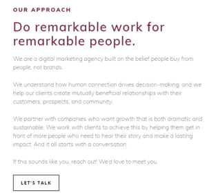
Check out our very own Wayward Kind “Story” page. We give readers snippet of what we do, with focus on cultivating digital conversations. So, what’s our CTA button? “Let’s Talk.” Our conversations aren’t just with existing clients, or their audience, they’re with everyone and we make that clear by telling them we want to talk to them.
 Opt-In Forms
People are often a bit skeptical about signing up for things. So, if they’ve gotten to the point where they’re ready to sign-up for a newsletter, a service, or anything really, GREAT! Microcopy matters here—it’s used as a way to quickly explain something or direct users to further information. Essentially, it helps them feel more confident about the choice they’re making.
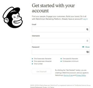
Check out the MailChimp sign-up form below. It tells you the benefits (“Find your people. Engage your customers…”), where to go if you already have a log-in, and clearly explains what your password needs to be valid. We’ve all had those frustrating moments where our passwords don’t work, right? It’s simple, yet informative, and it’s all because of some good microcopy.
Helpful Reminders
Did you abandon your shopping cart? Forget to check out related products? Well, microcopy will remind you. These tidbits of copy can not only guide users to make their purchase, but also create a playful conversation that will make them feel encouraged, even excited to take action.
Knowing what your users like can also help to create microcopy that will guide them to other useful products and services. Remember, your helping them. You’re the tour guide through the website. Consider what’s going to help them do that with ease and interest.
What Should Microcopy Do?
We touched on this above, but it’s worth diving a bit deeper into the intention of microcopy. So here’s a few key things to think about when getting your writing juices flowing.
Microcopy Should:
- Set expectations: Where users are headed, what they should do and why
- Speak the customer’s language: Align language and tone with your brand. If you’re fun, be fun in your microcopy. If your audience is made up of professionals seeking clear information, keep it simple and direct. You know your audience best.
- Be Informative: It’s not just there to look good—it explains, very briefly, something that’s important to the user
- Be Timely: This is huge. Consider when you want users to do something, and add the micropy in there. For example, on the homepage of your website. You probably want to get them to more of your services or “About” page quickly. So, put your CTA at the top, not the bottom. The chances of them getting to the bottom of the page and seeing the CTA button is minimal. Time it right, and you’ll probably give them more of what they need, when they need it.

Big or small, your copy matters and tells a story—and we love telling the stories of our clients. If you’re ready to get your digital conversations going, contact us today. We can’t wait to talk to you!


