CASE STUDY: WHITENESS AT WORK
DISRUPTING WHITE DOMINANT CULTURE, REPAIRING HARM, AND BUILDING SOMETHING NEW.
Supporting the mission to confront white supremacy culture in the workplace.

THE OPPORTUNITY
With more than 40 years of experience building equitable and inclusive organizations between them, Desiree Adaway, Ericka Hines, and Jessica Fish came to us with a powerful program to share with the world.
Whiteness at Work is a training program designed to help organizations uncover the ways in which white supremacy culture manifests in the workplace, and develop the language and skills to talk about it.
What they had was an impactful teaching tool that challenged white folks and organizational leaders to shift their thinking around racial justice. What they wanted was an online presence that would attract white people and organizational leaders who could embed these teachings into the workplace to decenter whiteness.
The Whiteness at Work training program was thoughtfully and purposefully designed to move beyond white fragility and dismantle white dominance. The platform, therefore, had to deliver a strong message in a way that was receptive and stirred a sense of responsibility.
THE GOAL
With more organizations tackling racism throughout the United States, it was important to present Whiteness at Work as the unique training program it is. We needed to create a site that intrigued customers the moment they landed, and provide a clear understanding of why they needed this program. We wanted to send a big, important message using as few words as possible.
While Whiteness at Work could be beneficial to any demographic, we knew that it was primarily geared towards white organizational leaders and white colleagues whose implicit biases were likely negatively impacting the lives of Black people and People of Color. The language had to conjure up a sense of responsibility to social justice in the workplace without deterring white folks who might otherwise feel attacked.
Digital Marketing Strategy
SEO Strategy

Website Design & Development
Social Media Marketing
Content Strategy

Copywriting

Branding
Video

Ads
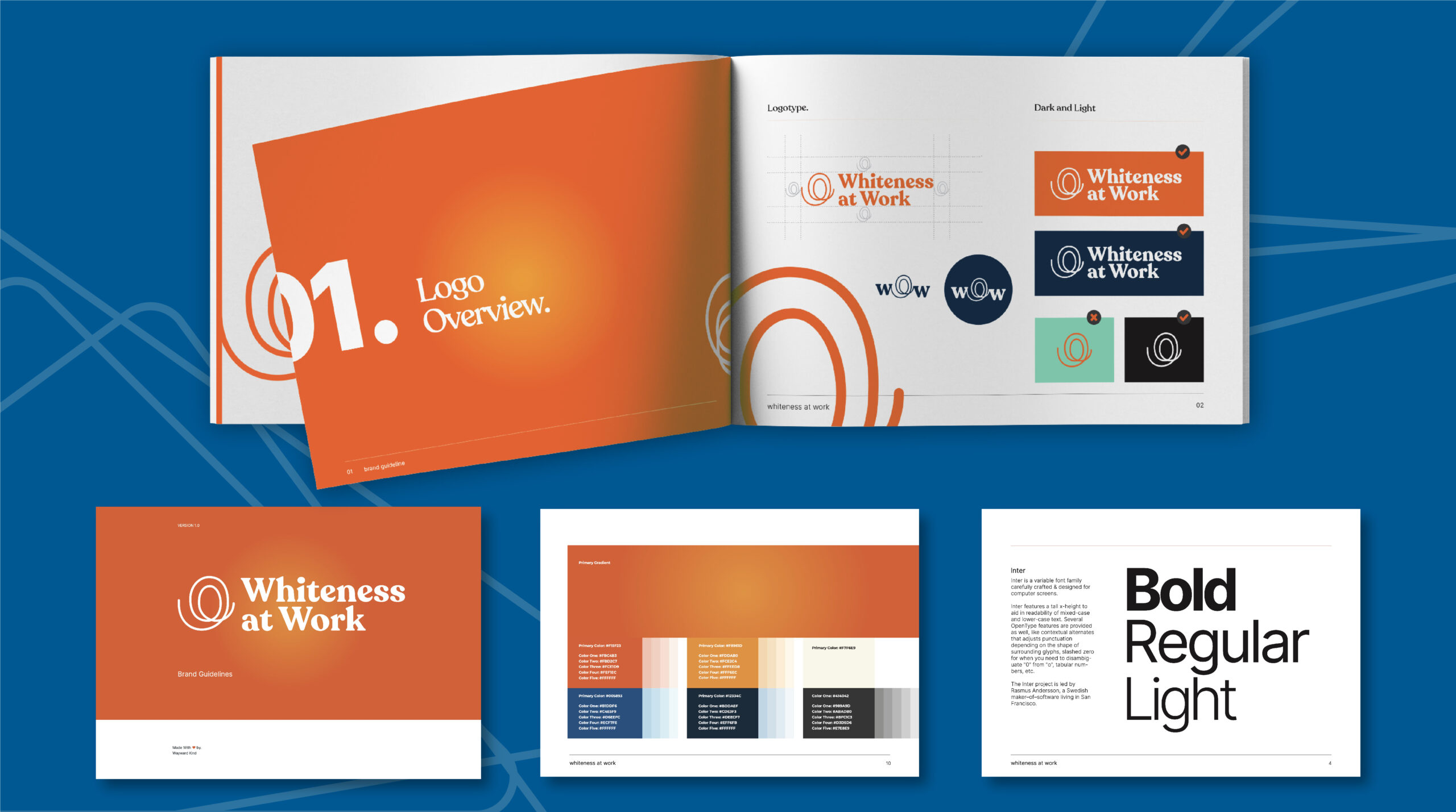
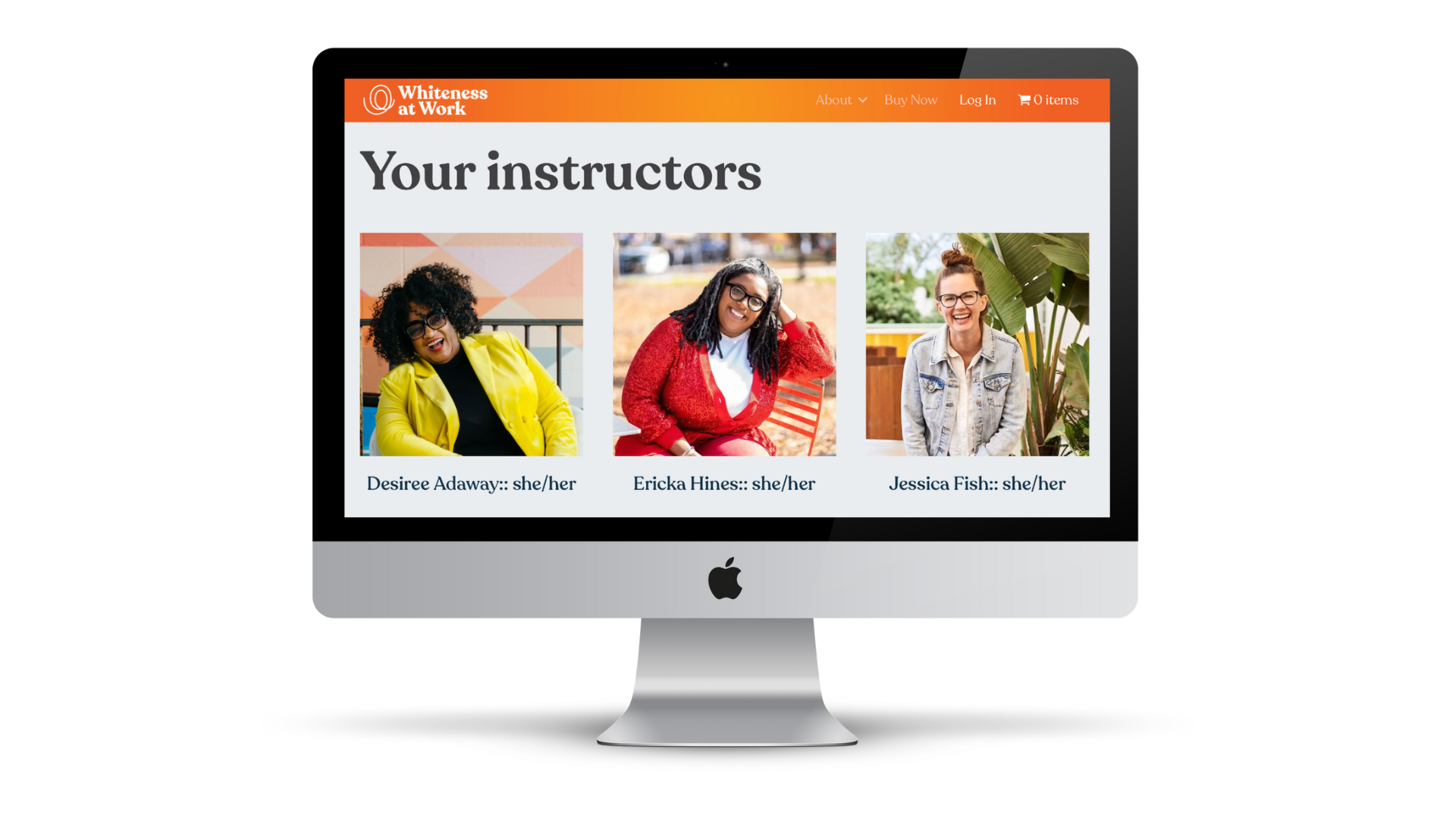
Whiteness at Work’s purpose of dismantling white supremacy in the workplace and creating a work environment that is equitable for Black, Indigenous, and people of color is bold. Therefore, we wanted to create a site that used bold colors and fonts to magnify their message to organizational leaders.
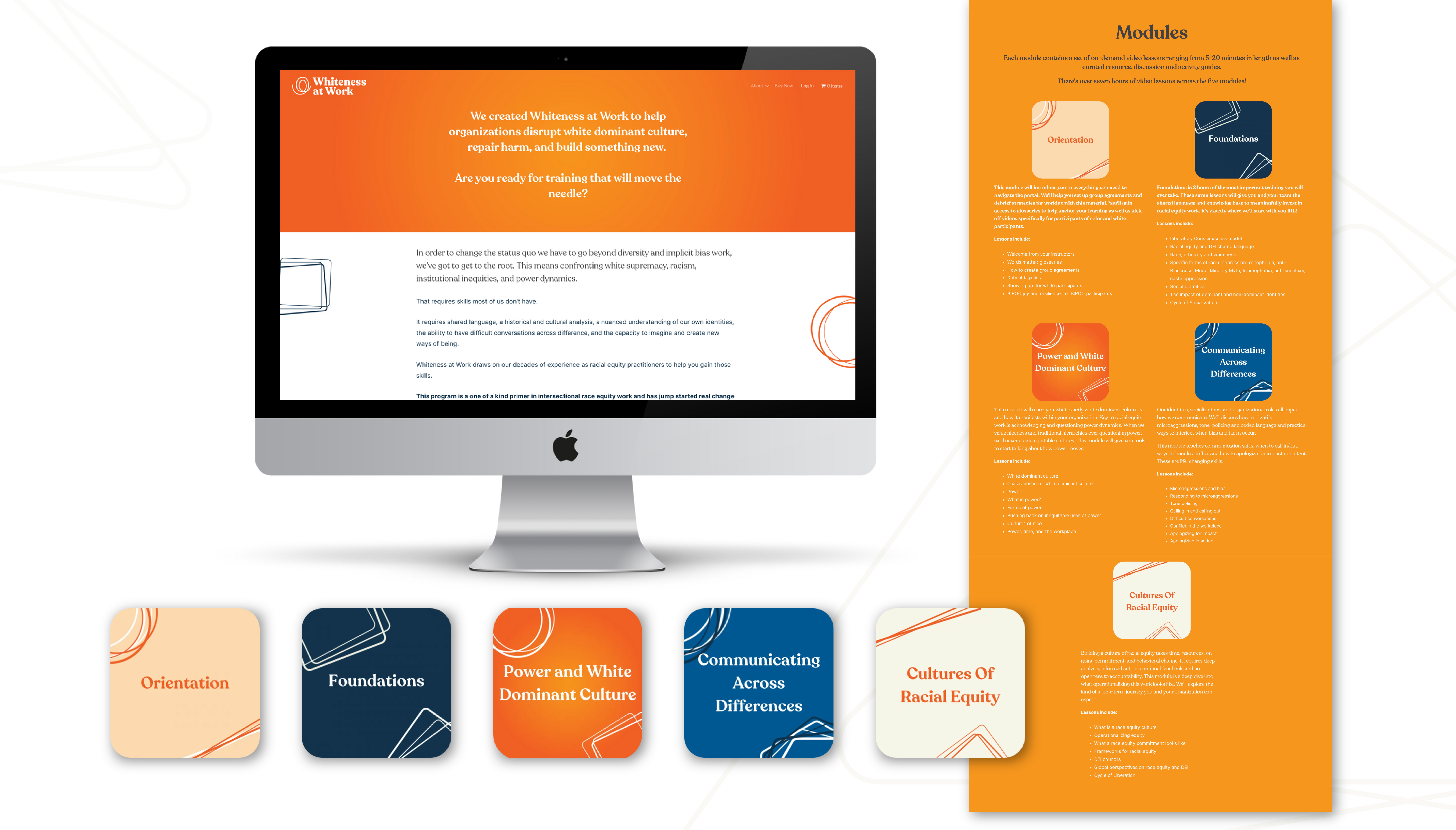
For this campaign, it was most important to extract the why, and make it front and center. The purpose of Whiteness at Work is, therefore, the first thing visitors see when visiting their landing page. Knowing the page would be text heavy, we designed graphics to break up each module description.
For those customers who prefer less text, we created a storyboard and developed a short video to market their course in a way that was both engaging and effective.
We wanted visitors to the site to feel a sense of responsibility to Black people and people of color and feel empowered to take action.
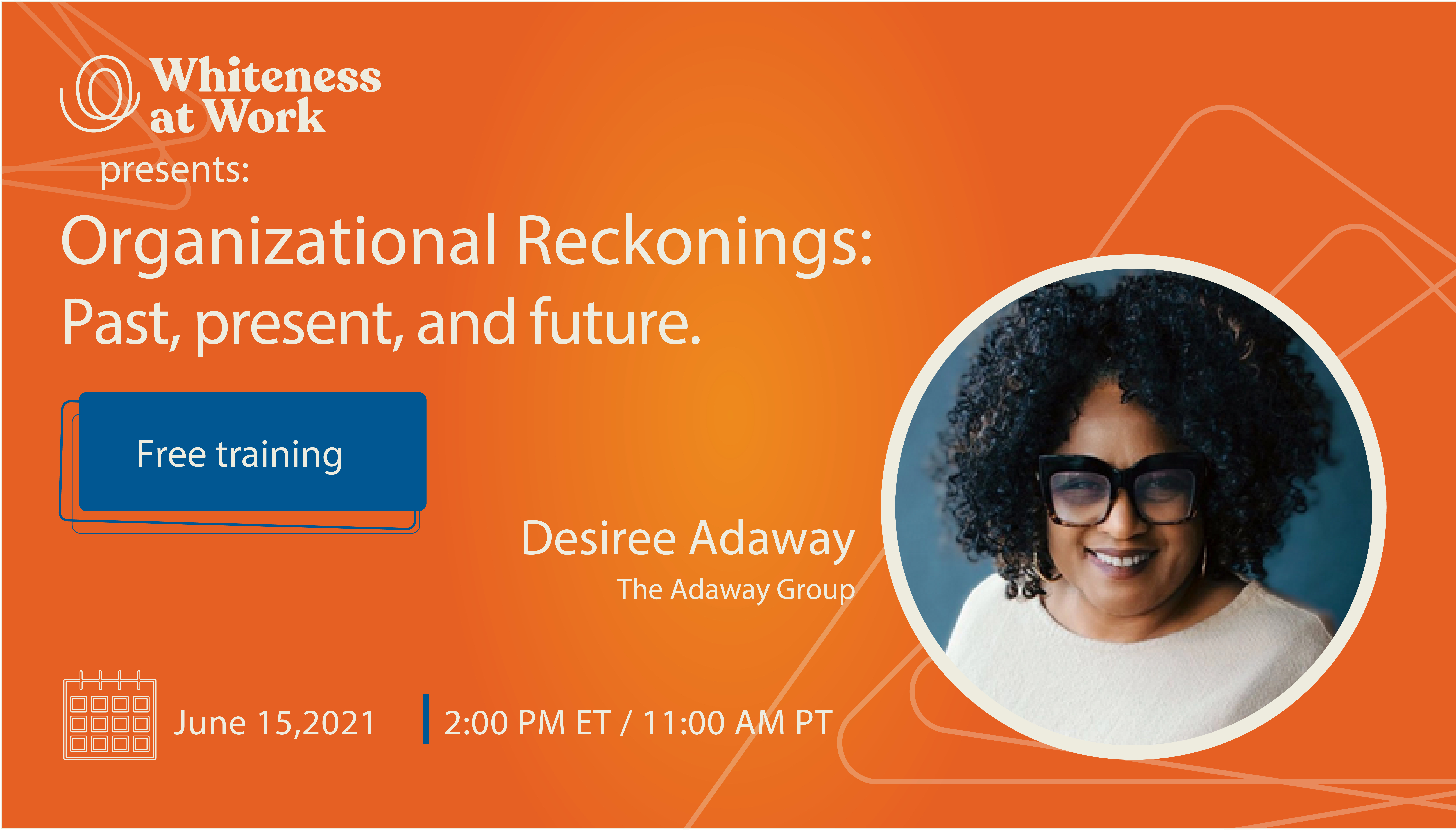
With a bold statement against a bright color palette, clean sections that lead visitors seamlessly through the selling process, and a site that skips the fluff and gets right to the point, Whiteness at Work is educating organizations around the world and challenging folks to invest in racial equity work.
MEET MORE OF THE WAYWARD KIND:
