Having a captivating website design is good for business and is a huge component to how your audience perceives your brand.
As the digital world continues to evolve, businesses have to consistently revamp their website designs.
Why is that?
Well, website design plays an intricate role in your audience’s decision to stay put or go to a competitor’s page. This decision includes whether your website appears outdated or suitable to their needs. Your audience wants to feel like you know what they’re looking for—in the shortest amount of time possible.
75% of users make judgments about a company’s credibility based on their visual design alone.
How can you make sure your website design makes a good first impression?
Let’s take a look at three website design trends and why they are so impactful in 2020. Listen close, so you don’t get left in the past.
Website Design Trend #1: Fluid Backgrounds
Being innovative in your website design puts you in the driver’s seat to guide your audience toward a specific service or action. Being creative in your design can trigger an action or emotion from your audience. Fluid designs are a combination of innovation and creativity.
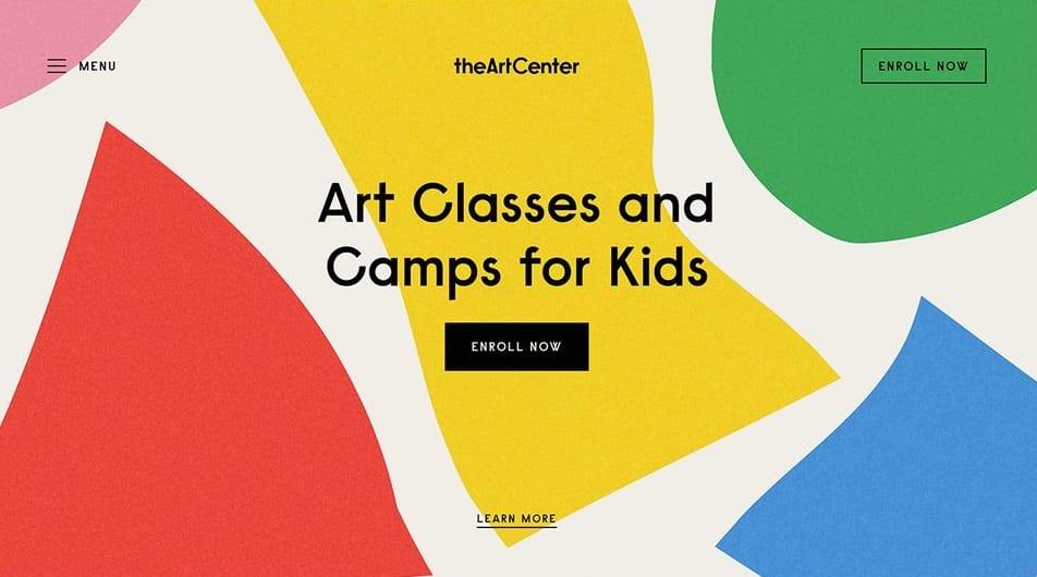
These forward-thinking layouts work by calling on organic shapes, and feel very natural. The shapes found in fluid design often work well for businesses that are looking to visually represent authenticity, innovation, and originality.
Using fluid design on a website can create connections for your audience; these visuals often resemble objects or places that your audience is already familiar with, and relates those feelings to your business. For example, a shape inspired by a lake will be rounded with curves. Placing this shape on your homepage will inspire similar feelings of subdued calmness and openness.
Check out the homepage below to see these organic shapes in action:

Not only do the organic shapes fill in the blank space on the site, but they also do so in a way that isn’t overwhelming to the eye—colors are partly to thank for this. We’ll get into colors and how they play a big role in web design in just a bit.
Fluid designs are also great for mobile responsiveness, which means that these designs can easily adjust to different screens and browsers, and look good no matter what type of device your audience is using to browse the web. Its flexibility makes fluidity one of the leaders in this year’s top website design trends.
Website Design Trend #2: Asymmetrical Designs
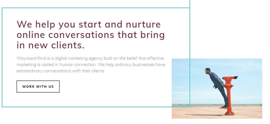
Asymmetrical layouts silently guide the eyes across the page toward the content and imagery you want them to see.
 These broken grid designs, as seen above, really grab the user’s attention pushing the boundaries of balance, as opposed to the simple mirroring effect that many web pages follow.
Broken grid designs defy the norm by creating a contrast between the right and left side of the homepage. The left side contains more content, while the right side adds a contrasting visual element. This layout purposely disrupts the harmony of the page yet still is appealing to the user’s experience.
Asymmetrical designs create a futuristic and visually appealing website that differs from the simplistic symmetrical layouts they are used to seeing. They present information in an unconventional way, allowing your audience to look at your content and services from a different perspective.
Website Design Trend # 3: Retro Design Aesthetic
Remember how fluidity works well because it draws from familiar shapes? Well, people are loving the retro aesthetic for the same reason.
While retro design may remind you of your childhood, there’s something to be said about the power of nostalgia. And this design trend pays homage to a much simpler time.
So yes, retro design is back. But that doesn’t mean it’s old and outdated.
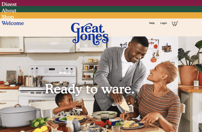
One modern approach to retro design is typography: big, bold lettering and thick cursive words.

Colors also play a big part in the retro design aesthetic. Greens and yellows, like the ones above, may remind you of your mom’s favorite sofa slipcover as they were also popular colors in the 1970s and 1980s.
Want to hop on this design trend without having your brand look like it’s outdated? Focus on typography and color.
One important thing to note is that these top 2020 trends are just that: they’re what’s popular right now. Incorporating these trends into your website design can give you that updated look, but website design trends may look different next year. When selecting your website design, it’s crucial to focus on your brand messaging—if you choose a retro design, make sure that it’s authentic and relevant to your audience, no matter what era we’re in.
Why Color Matters
Your website’s color palette sets the tone for the emotion that your audience will be feeling when viewing your website.
Color psychology is a big part of selecting brand colors: ever wonder why a lot of fast food restaurants use reds and yellows in their visual identity and restaurants? These are lively colors that are also often associated with rushing. Reds and yellows can subconsciously encourage patrons to eat quicker!
While B2B businesses have a wider color palette to choose from, specific industries often use similar colors.
For example, spas and wellness-focused businesses see success from calmer colors, like light blues, greens, and purples, because these shades encourage feelings of relaxation and calmness.

Your business’s color scheme depends largely on your goals and established messaging. If you want to be seen as a refined business, you may go with a darker scheme that’s often interpreted as elegant and sophisticated.
Let’s Trendset Together
The ultimate goals of website design are to keep leads on your website, and to make it easy for them to get all the information they need to make the move to work with your business.
While structure is a big part of guiding your audience’s attention down the page, there are a lot of subtle ways to encourage your target audience to click that call to action button, and have a little fun, too.
Become a game-changer in a world where your audience is always looking for the next best service.
Wayward Kind is a digital marketing agency focused on designing innovative websites that are true to B2B business’s core values. Want some guidance in taking the road less traveled? Connect with us to start pushing the boundaries in your industry today.

We can help you master your digital marketing strategy with CRO tips. Our team of strategists are experts at understanding you and your audience. Whether it’s setting up Google Analytics, or creating great landing pages, Wayward Kind is all about action. Ready to convert to a mindful marketing strategy? Contact us today!


