


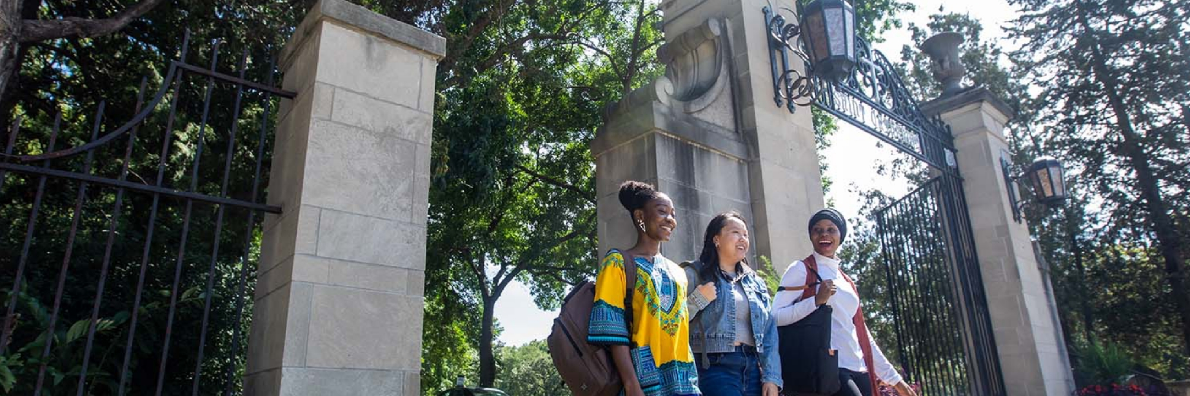
St. Catherine University is one of the largest private women’s universities in the nation. Founded in 1905, their mission is to educate women of all colors to lead and influence.
St. Kate’s, as the university is often referred to, came to us with a campaign to attract affluent donors for the renovation of their historic Mendel building. The purpose of these renovations was to attract, retain, graduate, and place BIPOC women in STEM leadership roles.
We knew we had to capture the attention of affluent donors who had countless options when it came to giving. We wanted to acknowledge the history of the university, but also highlight their modern approach to building diversity and inclusion within the disciplines of science, technology, engineering, and mathematics.
The goal was to present St. Kate’s campaign in a thoughtful and creative way that illustrated both a need, and a path forward. We needed donors to quickly recognize the problem St. Kate’s wanted to solve, and feel compelled to participate in their mission.
While the university did a fantastic job of creating an attractive and user-friendly site that centered both their commitment to diversity and their eagerness to help women succeed, we knew we needed an area that focused specifically on STEM careers.
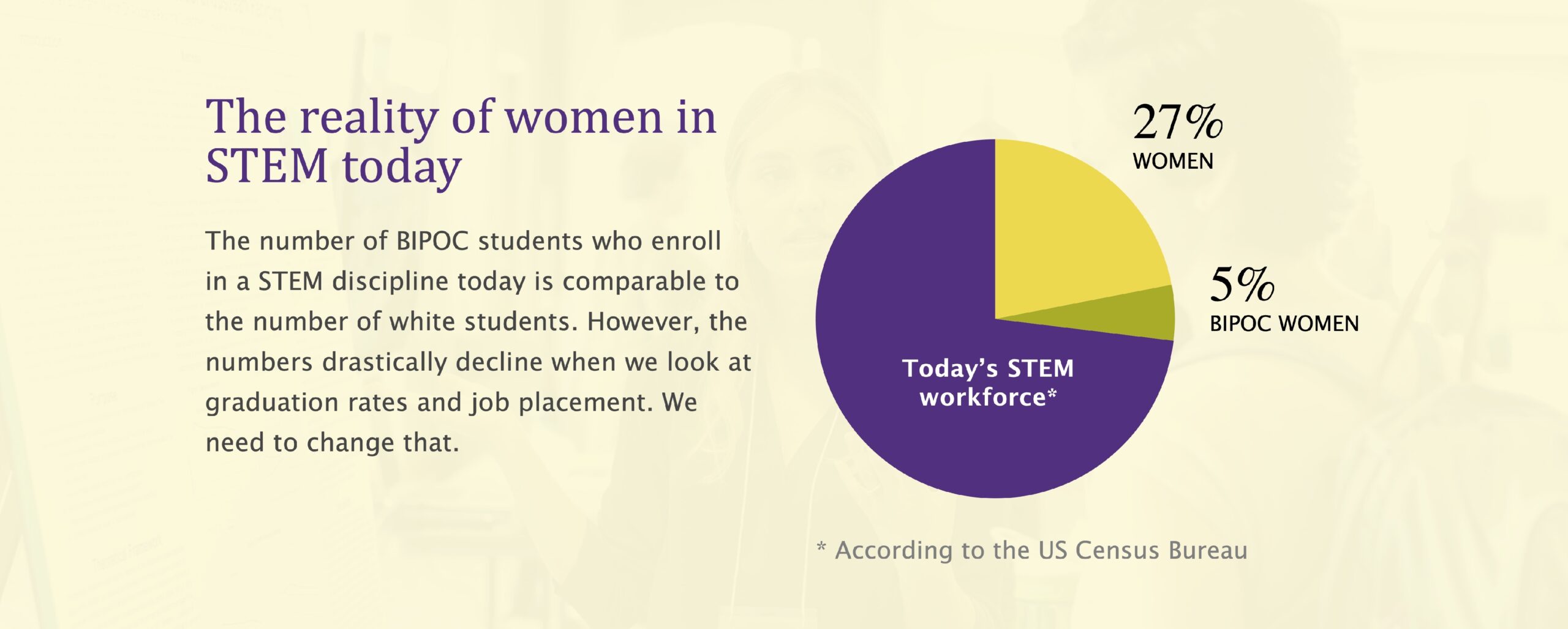
We wanted to develop a page that inspired innovation, displayed data analysis to support the need for more Women of Color in the STEM fields, and painted a more inclusive picture of what future STEM leaders could (and should) look like.
Digital Marketing
Strategy
SEO Strategy

Website Design &
Development

Social Media
Marketing

Content Strategy & Development

Copywriting

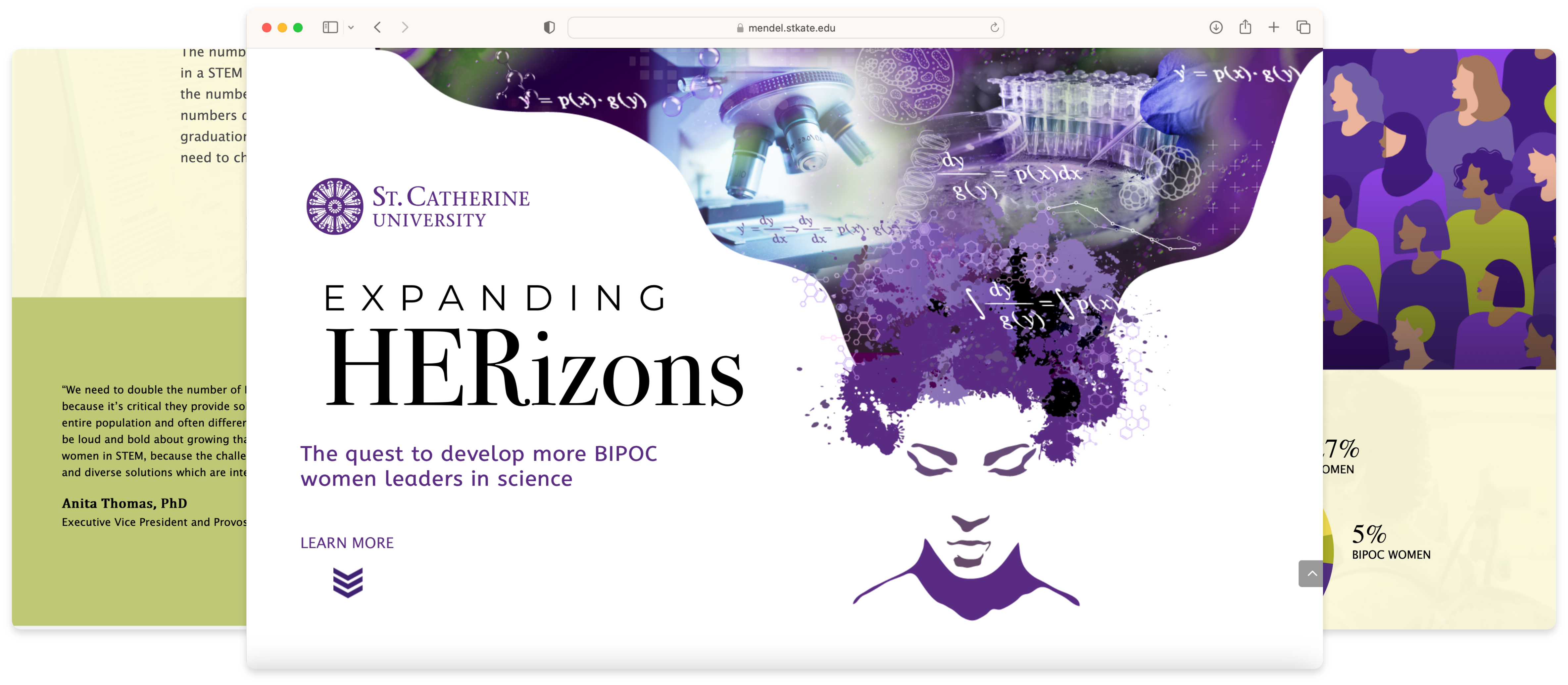
We began the process of developing an eye-catching, engaging, easy-to-navigate webpage that clearly defined St. Kate’s goals, and their reasons for pursuing each one.
For this campaign, we chose bright colors that popped the moment you landed on the page. The mission was clearly stated and was followed by a call-to-action that directed the visitor to begin scrolling.
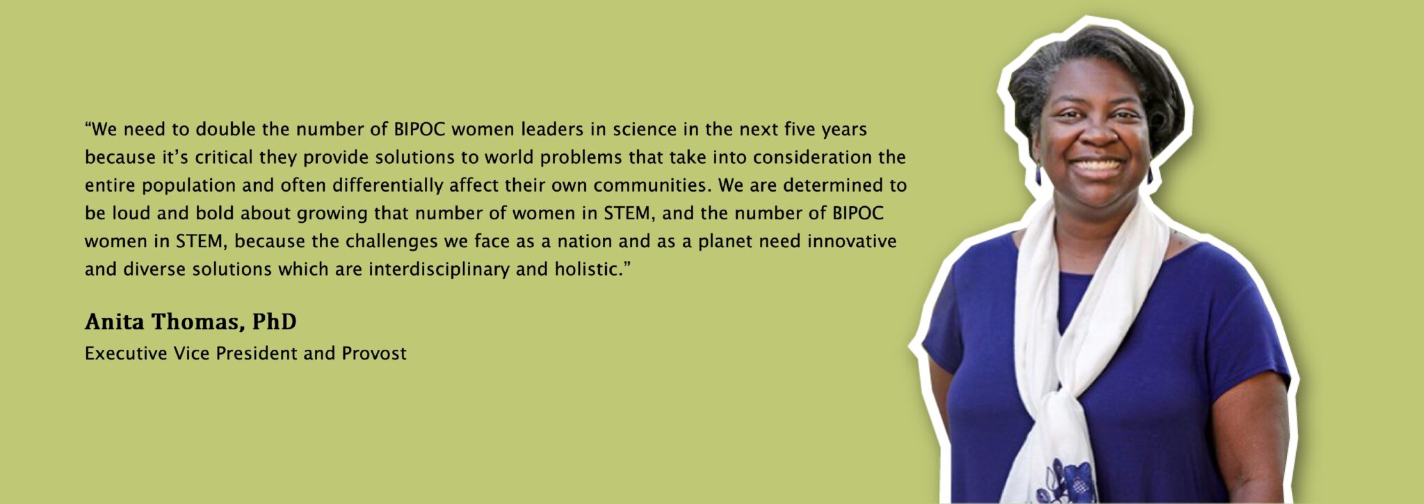
We continued by introducing the visionaries behind St. Kate’s mission using both video and images. The color palette reflected both the traditional feel of St. Catherine University, with a modern pop of vibrant accent colors.
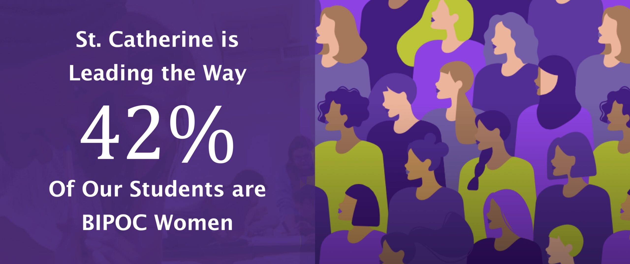
In between the shocking statistics of underrepresentation in STEM which we presented using beautiful, easy-to-read graphs, were reminders of why their mission mattered, and how St. Kate’s was the best place to launch.
The campaign attracted several generous donors with donations exceeding 1 million dollars. St. Kate’s is well on it’s way to building a state-of-the-art facility that prepares Women of Color to access leadership positions in STEM, and allows the benefits of STEM innovation to be experienced by all communities.

“The website is gorgeous, compelling, fact laden and powerful. You hit a home run and then lapped the parking lot!”
~ Beth Halloran, Executive Vice President, St. Catherine University